|
|
||||||||||||||||||||
|
|
|
|
||||||||||||||||||
|
|
||||||||||||||||||||
|
|
|
|
|
|
|
|
|
|
||||||||||||
|
|
|
|
|
|
|
|
|
|||||||||||||
|
|
||||||||||||||||||||
|
#1
 06-25-2008, 08:52 PM
|
||||
|
||||
|
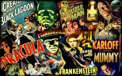
Help Amazon.com choose for Hammer films!
This is really cool.
Sony Home Entertainment is releasing Icons of Horror: Hammer Films, a new collection which retails later this year. The titles included in the collection are :
They are having a hard time deciding the DVD cover though, and they want our help in deciding this. Click the link and you can help choose the DVD cover art for them : http://www.amazon.com/gp/feature.htm...pf_rd_i=163396
__________________
"If you gaze for long into an abyss, the abyss gazes also into you." - Friedrich Nietzsche 
|
|
#2
06-25-2008, 09:01 PM
|
||||
|
||||
|
That's cool they're letting us vote but the art isn't that great.
__________________
Lee Widener, Author Website  Cartoon Artwork, Underground Art, Other Weird Stuff 
|
|
#3
06-25-2008, 09:08 PM
|
||||
|
||||
|
I thought the 3rd one was the best out of the lot, and voted for it. The images on it basically cover all the titles and a bit more of Hammer Horror's range.
The other two aren't that great for sure.
__________________
"If you gaze for long into an abyss, the abyss gazes also into you." - Friedrich Nietzsche
|
|
#4
06-25-2008, 09:20 PM
|
||||
|
||||
|
I voted for 3 as well.
__________________
Lee Widener, Author Website Cartoon Artwork, Underground Art, Other Weird Stuff
|
|
#7
06-25-2008, 09:39 PM
|
||||
|
||||
|
I voted for all 3. Seriously. just close the page and click the link again and you can revote.
__________________
Quote:
|
|
#8
06-25-2008, 10:30 PM
|
||||
|
||||
|
Quote:
__________________

|
|
#9
06-26-2008, 02:20 AM
|
||||
|
||||
|
I prefer 3.
But, I won't care if it comes in a brown paper bag as long as we get a release of the Two Faces of Dr Jeckyll and The Gorgon!
|
|
#10
06-26-2008, 05:38 AM
|
||||
|
||||
|
I voted for 2. I didn't reallyl ike the look of the 3rd one a bit too modern and it looks almost like a sci-fi set. Number two looks a lot more classic and timeless.
|
 |
|
|